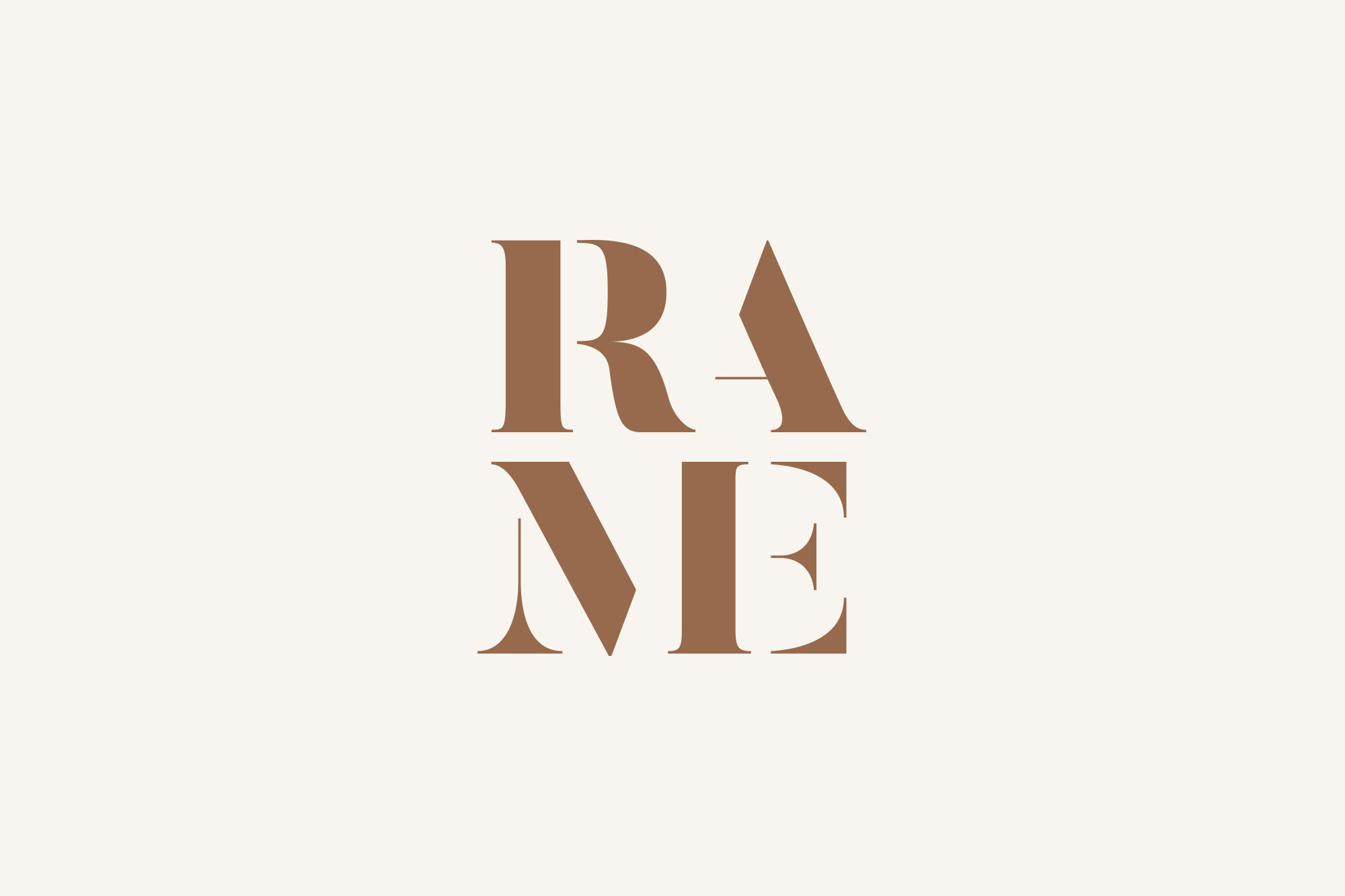
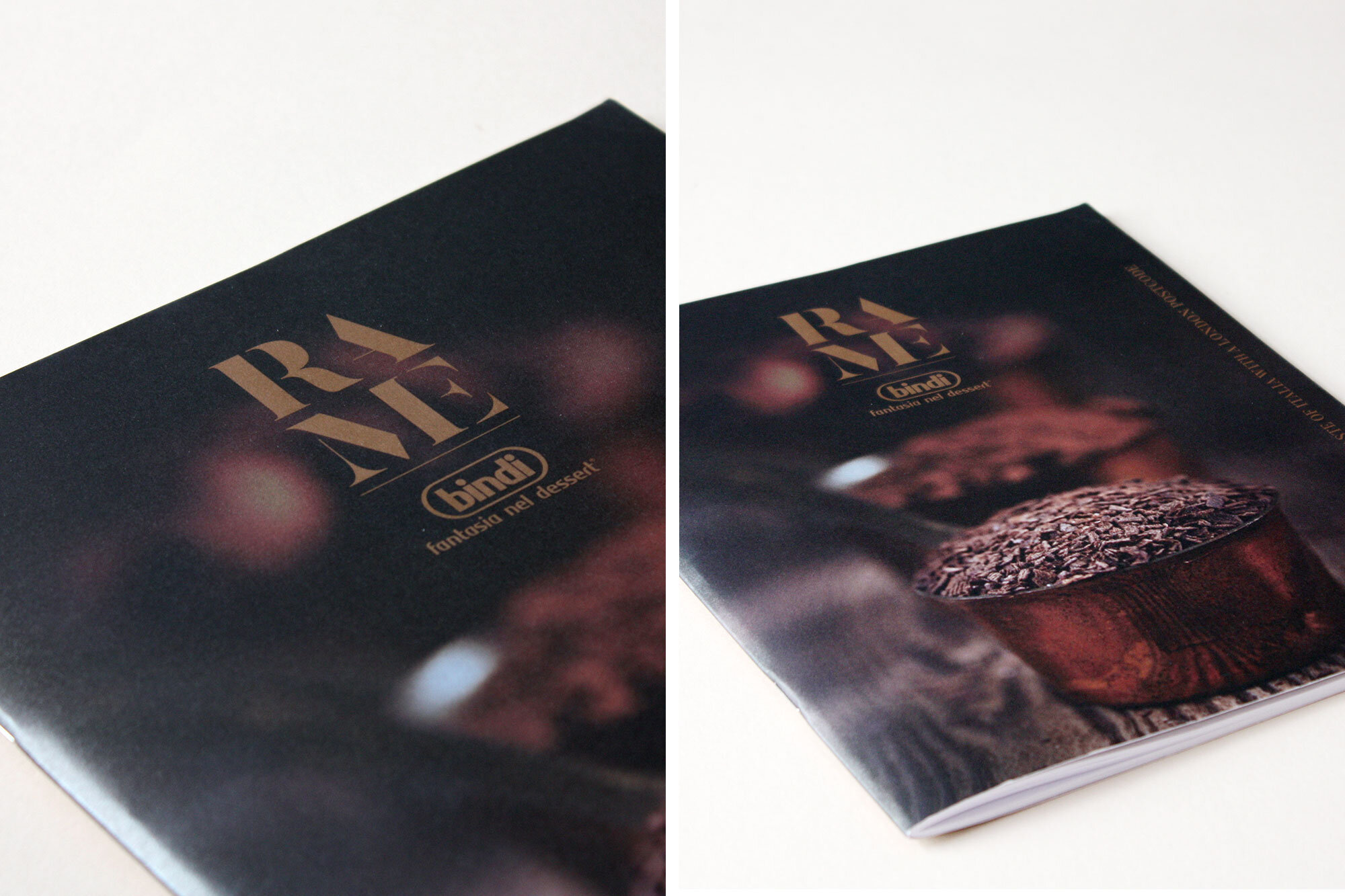
Rame [rah•may], meaning copper in Italian, became the foundation for an identity inspired by warmth, authenticity and traditional Italian cooking.
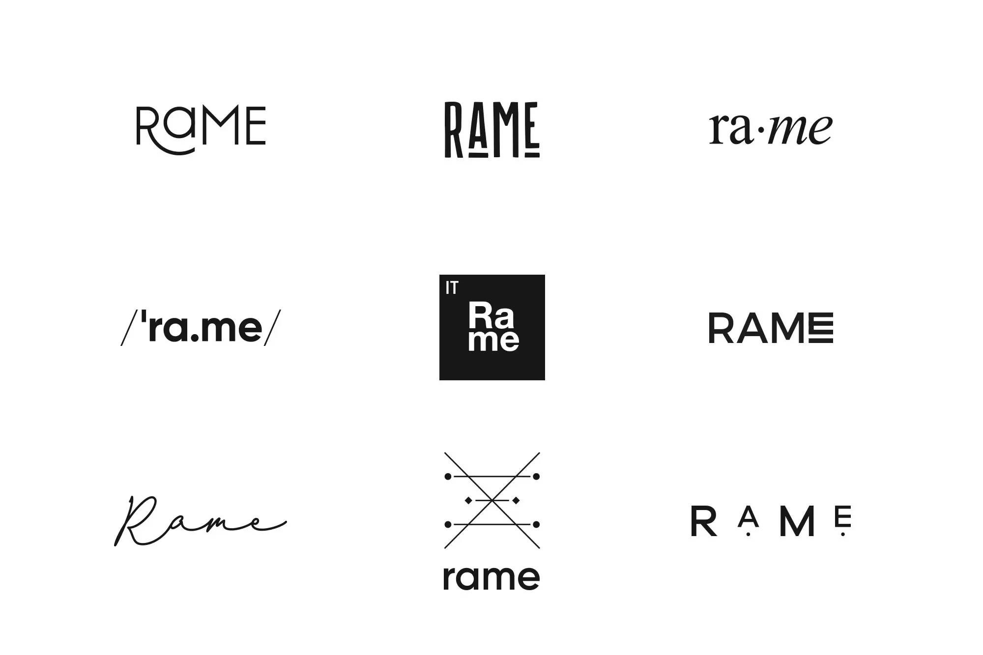
One of the key creative challenges was establishing a visual identity that not only reflected these qualities but also guided the audience towards
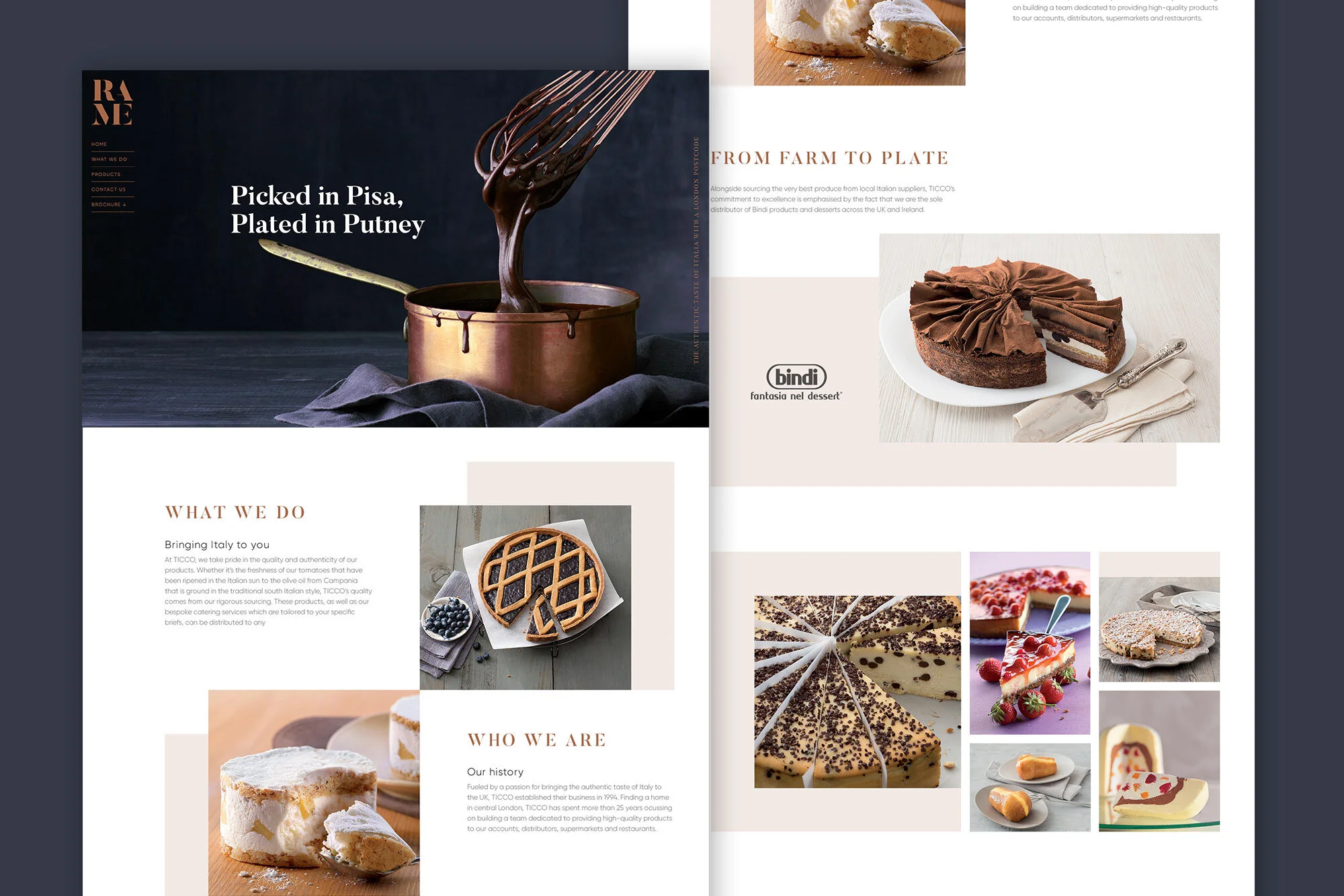
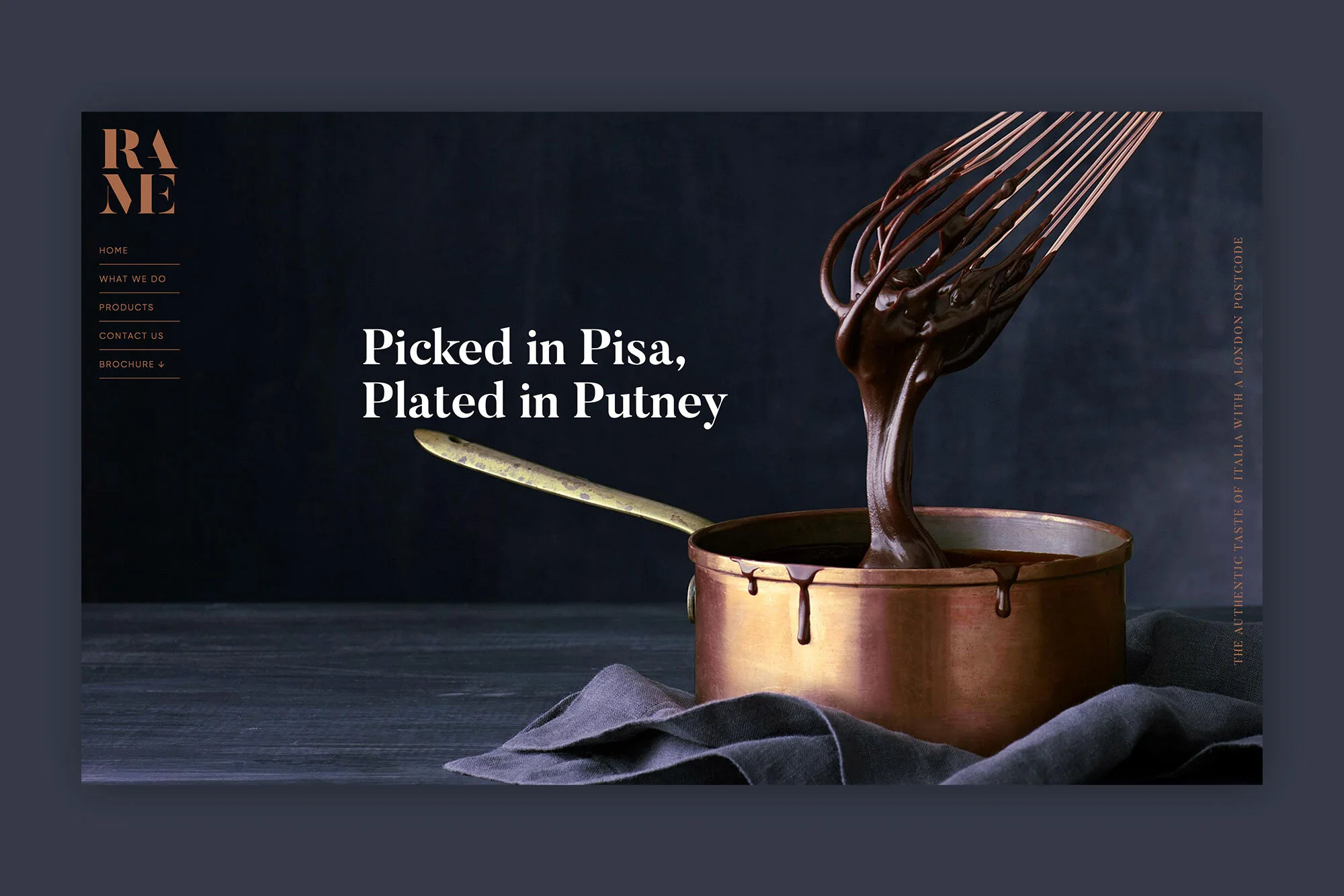
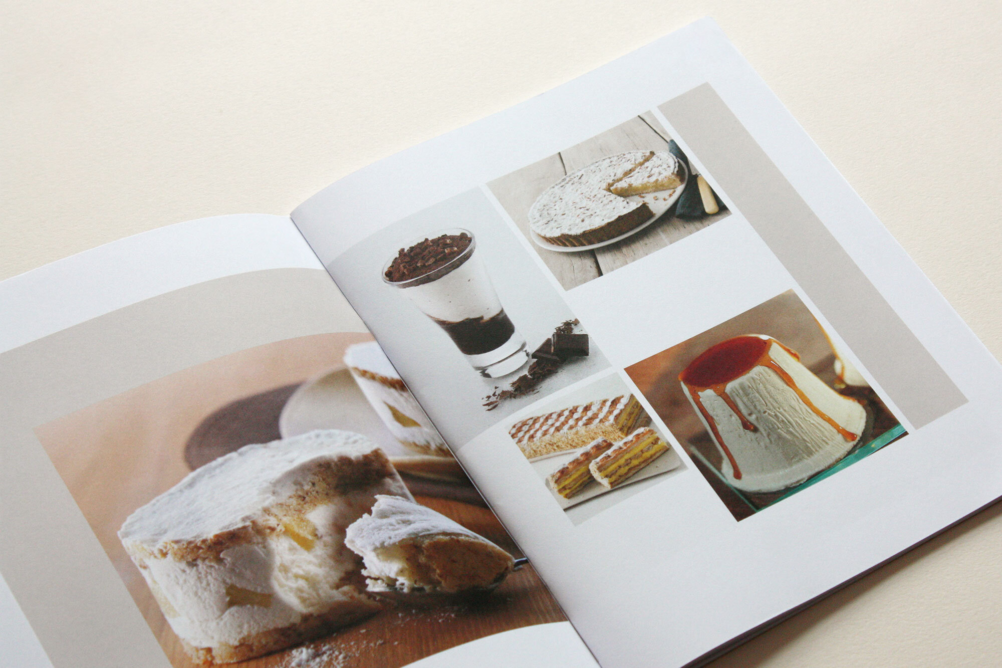
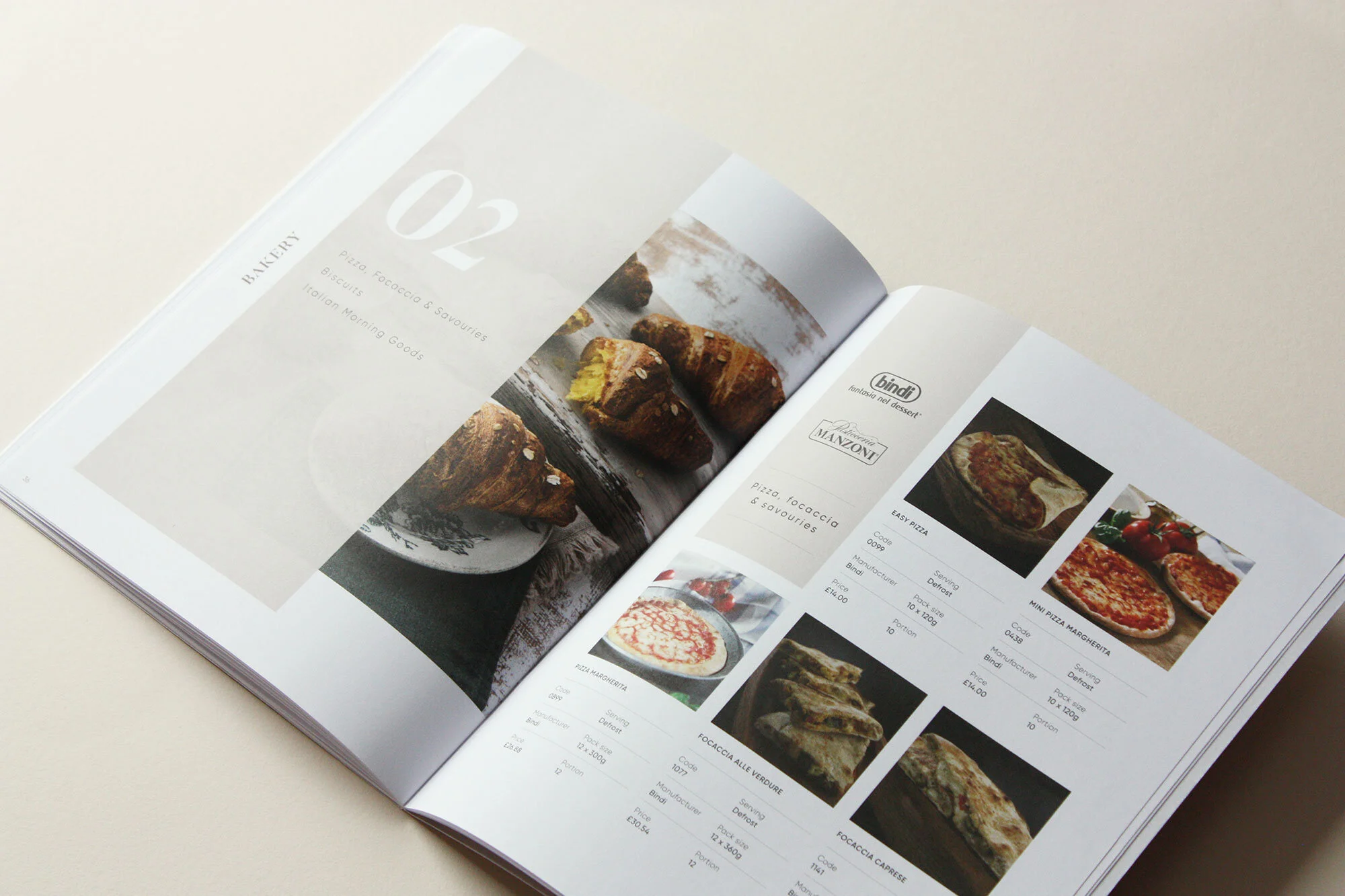
the intended pronunciation of the name. We explored a range of typographic approaches, including separating the word into its two syllables and experimenting with stacked compositions, ultimately creating a distinctive and versatile logo. The identity was extended across stationery, a bespoke single-page website and a printed brochure designed to showcase Rame’s food and selection of Italian brands.